Mobile App UX Design: 9 Principles That Separate Good Apps From Forgettable Ones
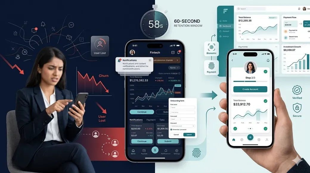
Good mobile app UX comes down to speed, clarity, consistency, and respecting how people actually hold and use their phones. The apps people keep coming back to nail a handful of things every single time: fast load times, obvious navigation, thumb-friendly layouts, honest feedback on every action, and designs that don't make users think twice before tapping something. Get these right and retention takes care of itself. Get them wrong and no amount of clever branding saves you.
Most apps don't fail because the idea was bad. They fail because using them feels like work. A button that doesn't look tappable, a form that resets when you rotate your phone, a loading spinner with no end in sight, these are the small frustrations that quietly push someone toward the uninstall button.
Below are nine principles that consistently separate apps people actually stick with from the ones that get deleted within a week.
1. Design For Thumbs, Not Fingers
Most people use their phone with one hand, and their thumb can't comfortably reach every corner of the screen. Important actions like search, cart, or navigation should sit in the bottom half of the screen, within what's often called the thumb zone. Anything critical stuck in the top corners is going to get missed or ignored simply because it's uncomfortable to reach.
2. Cut Load Time To The Bone
People decide whether an app is worth their patience within the first few seconds. Skeleton screens, cached data, and lazy loading for images all help an app feel instant even when it isn't technically instant. If your app has a blank white screen for more than a second or two while something loads, that's lost trust building up already.
3. Make Navigation Predictable
Users shouldn't have to relearn how to move through your app every time they open it. Stick to patterns people already know, bottom tab bars for primary sections, a hamburger menu only when there's genuinely a long list of secondary options, and a back button that always goes exactly where they expect. Novelty in navigation is rarely appreciated. Predictability is.
4. Give Feedback For Every Action
Tap a button and something should visibly happen, a color change, a small animation, a haptic buzz, anything that confirms the tap registered. Without this feedback, users tap again, sometimes triggering the same action twice, like submitting a payment form two times because there was no confirmation the first tap worked.
5. Respect Real World Conditions
Not everyone using your app has a flagship phone or a strong connection. In markets like India, a huge share of users are on mid-range Android devices with patchy 4G, sometimes even 2G in smaller towns. Apps that assume perfect conditions break down fast for these users. Lightweight images, offline states that actually communicate what's happening, and forms that save progress locally all matter more than they get credit for.
6. Keep Forms Short And Forgiving
Every extra field in a signup or checkout form is a chance for someone to abandon the process. Ask only for what you need right now, and let the rest come later through progressive profiling. When errors happen, tell users exactly what went wrong and where, instead of a generic message that leaves them guessing.
7. Use Familiar Visual Patterns
A checkbox should look like a checkbox. A toggle should look like a toggle. Users have spent years learning what interface elements mean across every app on their phone, and fighting that learned behavior for the sake of originality usually backfires. Save your creative energy for branding and illustration, not for reinventing basic controls.
8. Design Empty States And Error States On Purpose
What happens when a list has nothing in it yet, or when a network call fails, tells users a lot about how much care went into the app. A blank screen with no explanation feels broken. A friendly empty state with a clear next step feels intentional. The same goes for errors: tell people what happened and what to do next, not just that something went wrong.
9. Test With Real Users, Not Just The Design Team
A flow that makes perfect sense to the person who built it can completely confuse someone seeing it for the first time. Regular usability testing with actual target users, even something as simple as five people trying a new flow, catches problems no amount of internal review will. This is often the difference between an app that looks good in a design file and one that actually works in someone's hands.
The Real Pattern Behind All Nine
None of these principles are really about aesthetics. They're about reducing friction and respecting the user's time, attention, and context. An app can look visually stunning and still fail if people have to think too hard to use it. The apps that last are the ones that feel almost invisible, where the design gets out of the way and lets people do what they came to do. If you're building or refining a fintech, SaaS, or consumer app and want these principles applied with real India market context in mind, working with an experienced UI/UX Design Agency can help turn this into an actual product rather than just a checklist.
Frequently Asked Questions
What is the most important principle in mobile app UX design? Reducing friction matters more than any single visual choice. Fast load times, predictable navigation, and clear feedback on actions consistently outperform flashy design when it comes to retention.
How does mobile UX design differ between markets like India and the US? Device performance and connectivity vary far more in markets like India, where a large share of users are on mid-range Android phones with inconsistent network speeds. Designing for these real world conditions, rather than assuming flagship devices and fast wifi, changes decisions around image sizes, offline handling, and form design.
How often should usability testing happen during app development? Ideally at every major stage, not just before launch. Early testing on wireframes catches structural problems, while testing closer to launch catches smaller usability issues that are cheaper to fix before release than after.
Does good UX design increase app retention? Yes. Friction is one of the biggest drivers of app abandonment. Apps that load fast, communicate clearly, and behave predictably see meaningfully better retention than apps with the same features but rougher execution.