FLOORPLANGIRL's
60-30-10 Rule Color Studio
Master Your Design Ratios
Selecting the perfect color scheme is often the most challenging step in any design project—whether it's an interior remodel, exterior paint job, or professional branding. Over-relying on a single color leads to flat, boring results, while too many colors create visual chaos.
My 60-30-10 Color Palette Generator removes the guesswork. This tool instantly creates expert-approved color combinations based on the golden ratio of design, ensuring harmony, balance, and professional contrast every single time.
Understanding the 60-30-10 Rule for Perfect Harmony
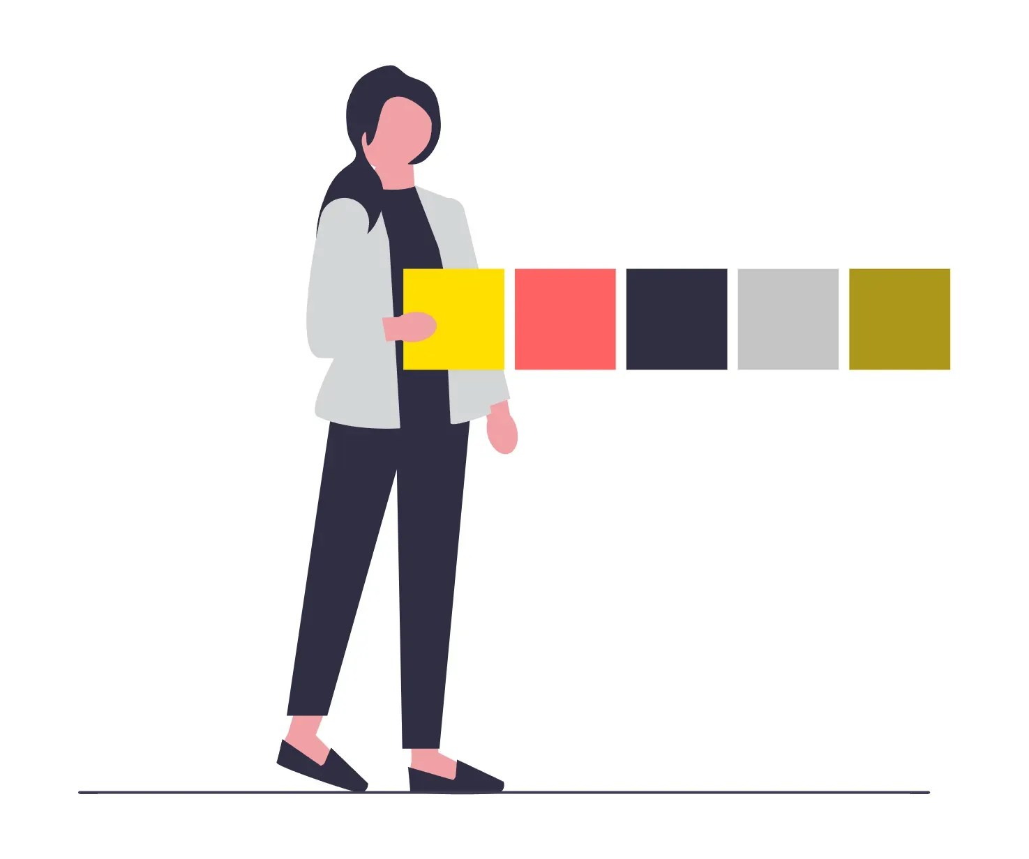
The 60-30-10 principle is a foundational rule in interior and graphic design that helps distribute colors visually to create an aesthetically pleasing and balanced look.
60% (Dominant Color / Base): This is the main color used across the largest surfaces—walls, major furniture, background of a website, or main siding of a house. It provides the foundation and sets the mood.
30% (Secondary Color / Mid-Tone): Used for items that support the dominant color—cabinets, textiles, accent walls, or trim. This color adds interest and depth, ensuring the design isn't monochromatic.
10% (Accent Color / Highlight): This is your high-impact color, reserved for small details—artwork, throw pillows, decorative objects, or calls-to-action (CTAs) on a website. It delivers the necessary pop and contrast.
Contrast (Text/Trim): I include a fourth Contrast shade to ensure excellent readability and definition for trim, shadows, and text against your base color.
This tool automatically applies this proven ratio, so you can focus purely on the visual impact of the colors themselves.
Generate Palettes for Any Real Estate or Branding Need
My generator is categorized to address the specific needs of design professionals and homeowners in the real estate, architecture, and digital space.
Interior Design Color Palettes
Find balanced schemes for whole-house renovations. Whether you need a Modern Greige Base for a welcoming living room or a Scandinavian Light palette for a minimal kitchen, instantly preview how your 60%, 30%, and 10% shades will interact in a physical space.
Exterior Home Color Combinations
The exterior presentation, or curb appeal, is critical for real estate value. Use my exterior category to find high-contrast, durable color schemes, from Modern Farmhouse siding and trim combinations to classic Tudor Revival tones.
Digital & Social Media Branding
For designers and real estate marketers, consistent digital branding is essential. Generate palettes specifically suited for:
Web (Digital): High-contrast schemes with proven CTA colors (10% accent) for clean, high-converting websites.
Social (Visual): Vibrant, cohesive palettes designed for engaging graphics, Instagram posts, Stories, and Canva templates.
How to Use the Generator
Select Your Category: Choose from Interior, Exterior, Web, or Social based on your project.
Generate: Click "Generate New Palette" to instantly produce a four-color scheme.
Review: See the colors side-by-side with their corresponding 60-30-10 role, HEX code, and simple color name.
Copy: Click "Copy All 4 HEX Codes" to instantly save the full scheme, or click any individual color block to grab its specific HEX code for immediate use in paint apps, graphic design tools, or web code. The generated codes are ready to paste directly into tools like Canva for your branding and social media posts.
Stop struggling with color decisions. Start designing with confidence and professional intent today.