Welcome to my domain!
Hello, my name is Logan Stamps. My approach to design and art emphasizes clarity, purpose, and visual intrigue.
My focus is on thoughtful layouts built with purposeful typefaces and decisive color palettes. Whether monochromatic or experimental in tone, every work creates a fine balance between line, space, and shape to develop structure and focus. I strongly believe that a foundation, when thoughtfully carried out, can make all the difference.
My aim is to offer all of my clients new ways to look at familiar ideas, or even ideas that have yet to be summoned. Every project poses new challenges that cause me to think differently which blends a mix of ideas into awesome experiences that resonate beyond the original application. If my work has left viewers with a sense of surprise, relevance, and intent, then I have succeeded in my efforts.
My collaborations always begin with a conversation. Identifying the needs of my client are always approached with respect and curiosity. Whether my application is solely digital, traditional, or a mixture of both worlds, I put in as much work into research as I do the actual work itself. I work through iterations and enjoy actively working in front of my clients to show them into the world of design, sparking creativity and curiosity on both ends. I deliver results that exceed expectations, because that is my goal.
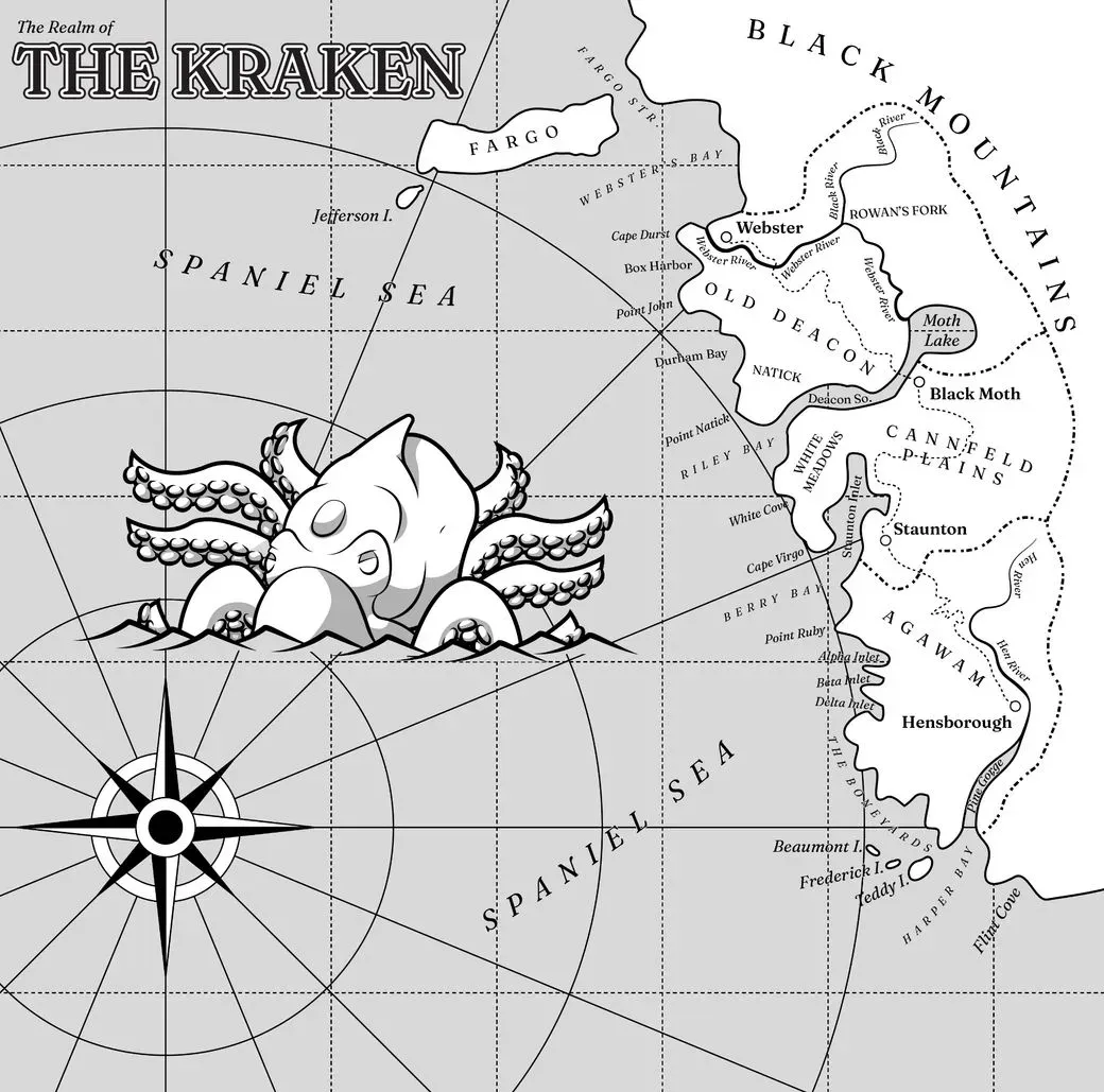
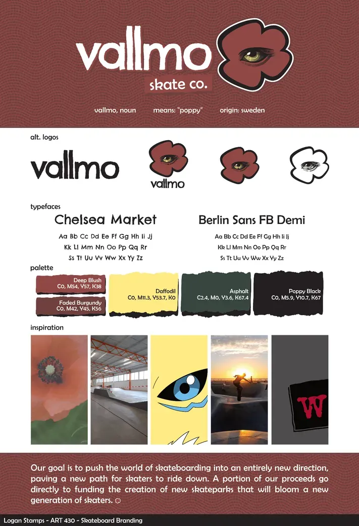
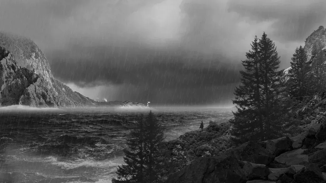
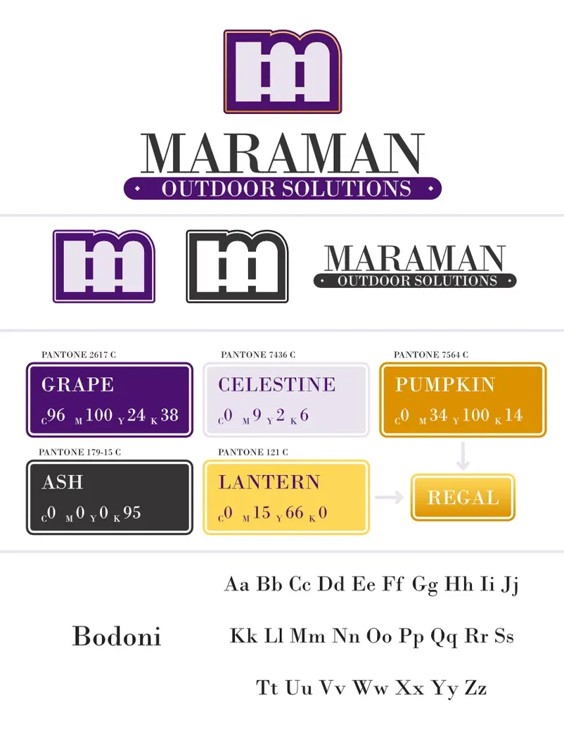
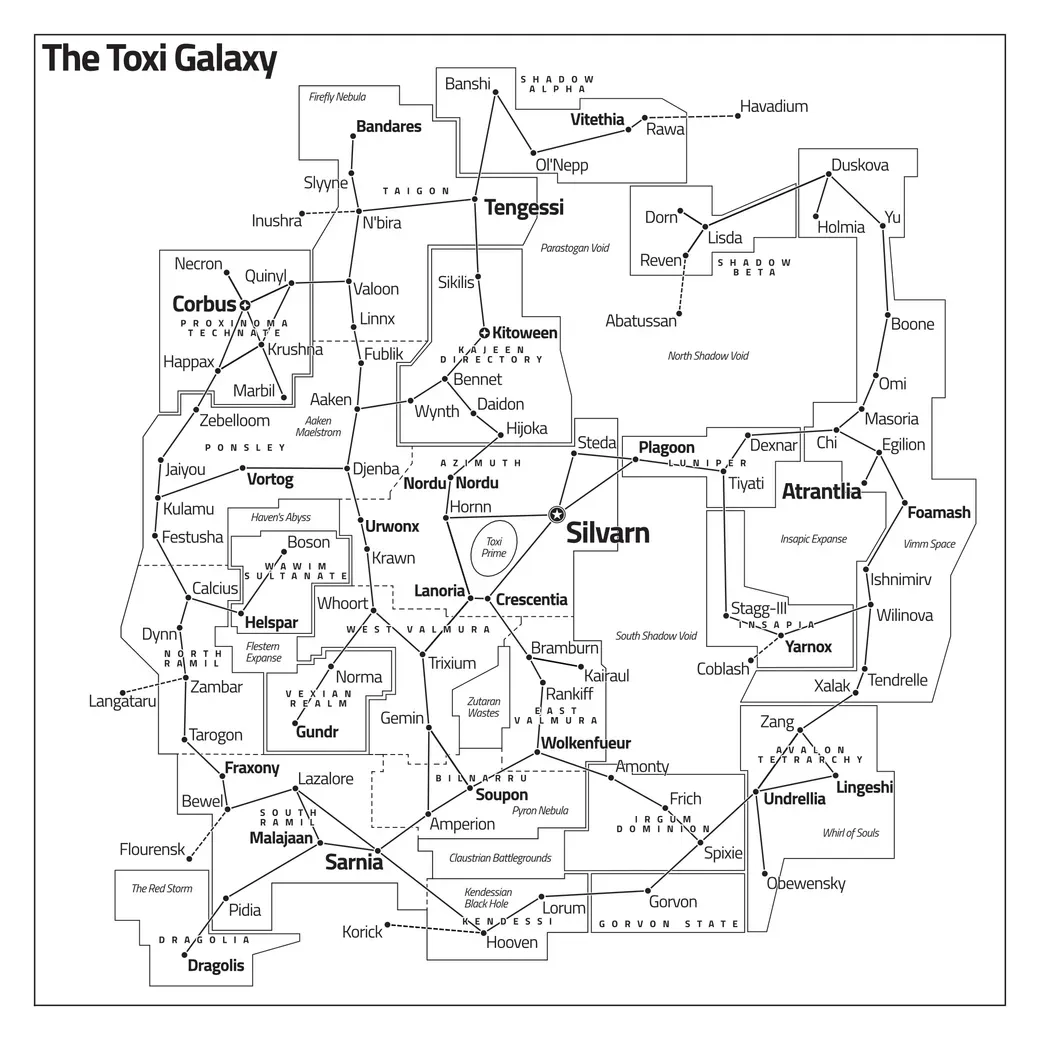
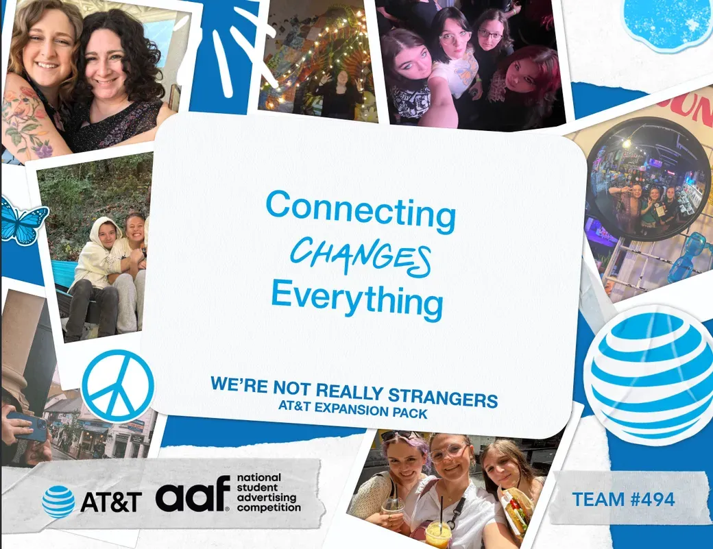
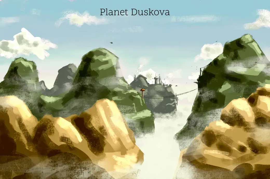
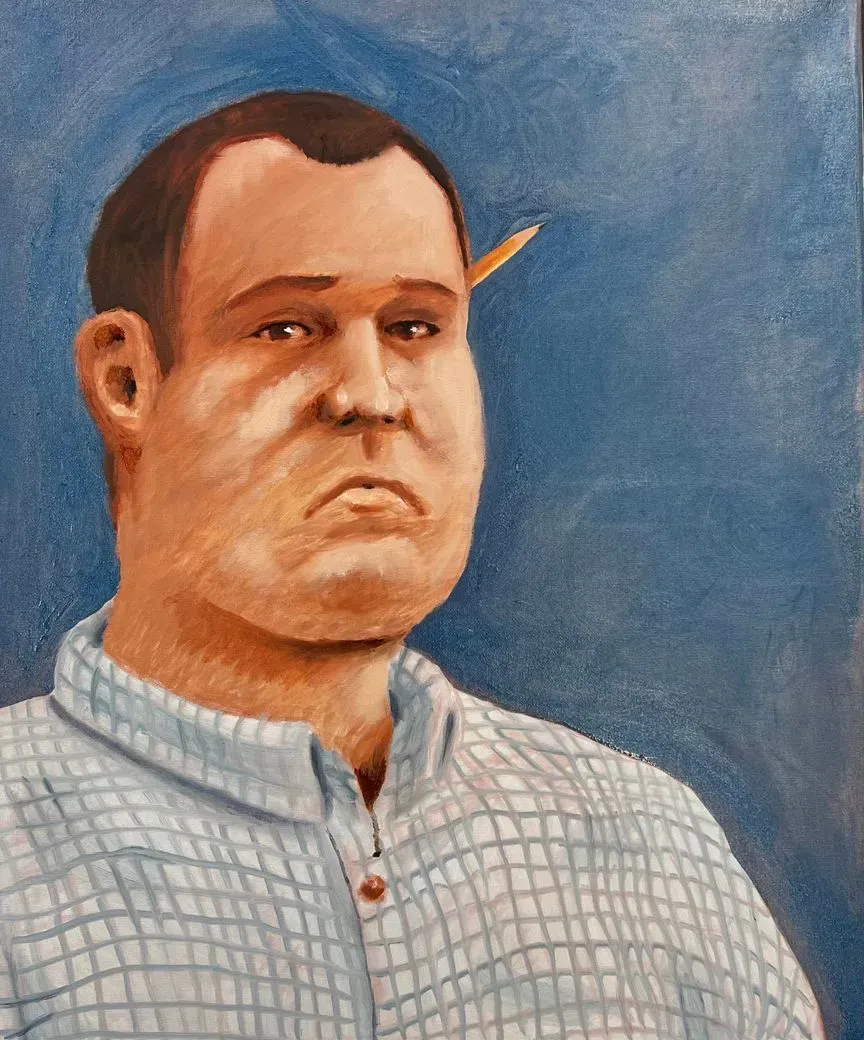
Gallery


My Time At Imagewest: My First Internship
My first true dive into professional work was at my internship at Imagewest. It wasn’t always a pleasant journey but I learned to not just work with a large-scale team, but also had a huge responsibility to keep our team afloat through research and citation work. I may have not been a leader in the project but I still had a valuable contribution where we may have not went to the competition without my help.
It was clear to me that my time at Imagewest enabled my UX philosophy to take shape. I have a philosophy centered around simplicity and clarity, ensuring the user is always in the clear about knowing what to do and where. Do keep in mind, just because I say something is simple doesn’t mean it has to look simple.
Later in 2025, I was able to become a manager for my team, which gave me a new sense of purpose in what graphic design is about. Good designs can exist in isolation, but this is almost never the case. Good designs are almost always developed by a team of people and giving them the tools and resources to work efficiently is a must. In my far future, I see myself working as a traffic manager aiding my team in making the best possible work they can.
Case Study: Cypress Boutique Hotel
Solving a Problem
I wanted to create a brand that would to both tourists and locals for a city on the other side of the world. The problem was how to create a hotel concept that incorporates both traditional values as well as acting as a modern ideal for what a hotel can be.
Research Process
I went through a variety of locations before I ultimately decided on the city of Tehran, located in Iran. I chose this location because it had a fine balance of familiarity and distance from what I know here in the West. I discovered trends such as ornamentation, historical ties to the Persian Empire, and a popular process of creating soap in the Middle East which I found to be a unique selling point to what would eventually becoming my hotel concept. I discovered that Tehran has a great amount of tourism locations such as the Azadi Tower, Tabiat Bridge, the Golestan palace, etc.
Design Process
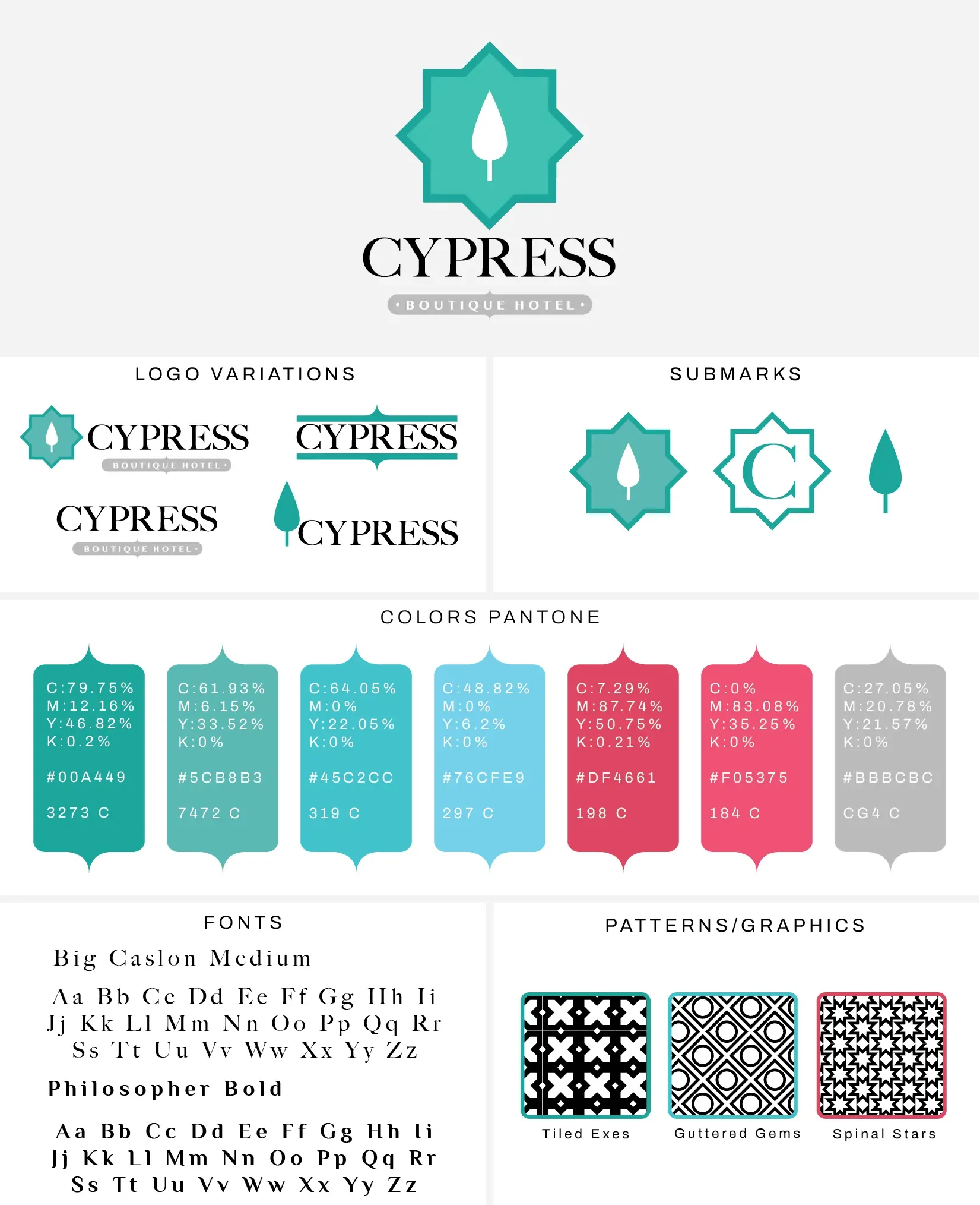
I wanted to create something simple, because I figured such a direction would balance out the ornate details of where and what my hotel would be. I started with five logo directions, with two initially going past the sketch stage. I eventually chose the cypress tree direction, because I imagined my hotel have a central courtyard (with a single tree in the middle), highlighting the landmark of the hotel itself.
I liked the idea of playing with the colors red, green, teal, and blue, but I ended up with teal because it is a soothing color in an otherwise harsh climate.
Final Outcome
After I narrowed down my color and logo, I began to refine my selection. The logo would be paired with an appropriate typeface as well as a subtitle saying “BOUTIQUE HOTEL”. The subtlety of the text was crucial to balance the otherwise simplistic logo.
After I put everything together, I began creating alternate logos as well as applications where not just the logo, but the feel of it would be used in other places, such as an animated logo, a key card, a door hanger, etc.
Reflection
This was my first long-term case study and I must say that there are things I would change since I started. I would definitely alter some of the philosophies I took with this project. I had the mentality of pairing a simple logo with complex architecture, but I think now that my skills have greatly improved, I would consider even more research and sketches.
My usages of mock ups were a challenge but now I am capable of creating my own, leading to more personalized case study than just using free stock alternatives.
Frequently Asked Questions
What are my hard skills?
I can use the following software:
-
Windows/MacOS; Microsoft Office Suit (Word, Excel, Powerpoint, Outlook, Publisher), Figma, Basecamp
Adobe Suite (Photoshop, Illustrator, InDesign)
Affinity Suite (Photo, Designer, Publisher) & Affinity by Canva (try it out, it's free for all of us!)
Blender, Maya
Procreate
-
I understand and can implement the following concepts:
Pen & Ink, Marker, Watercolor, Oil, Pastels, Colored Pencil, Guoache
Color Management, Pre-Press Production, Quality Control
Where can I find my resume?
Right Here!
Where can I view more of your work?
I post on DeviantArt as well as on Instagram. You can find the links for these respective places on my Linktree.